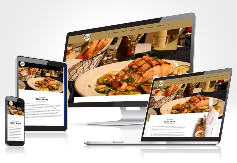
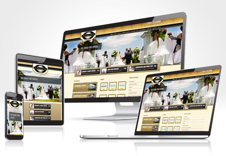
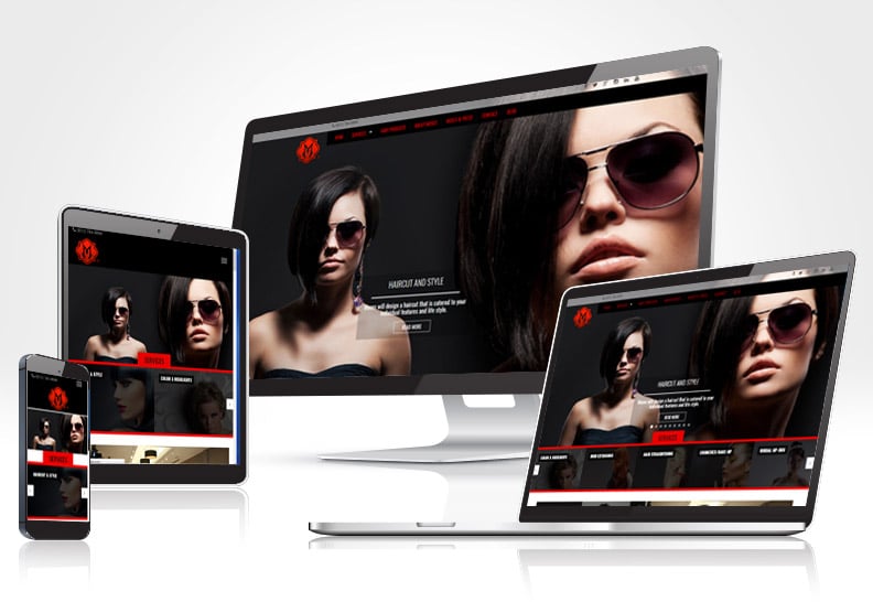
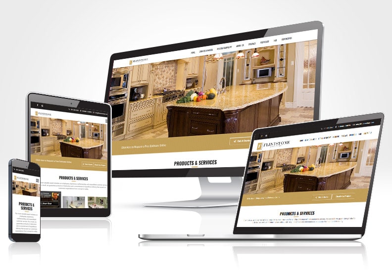
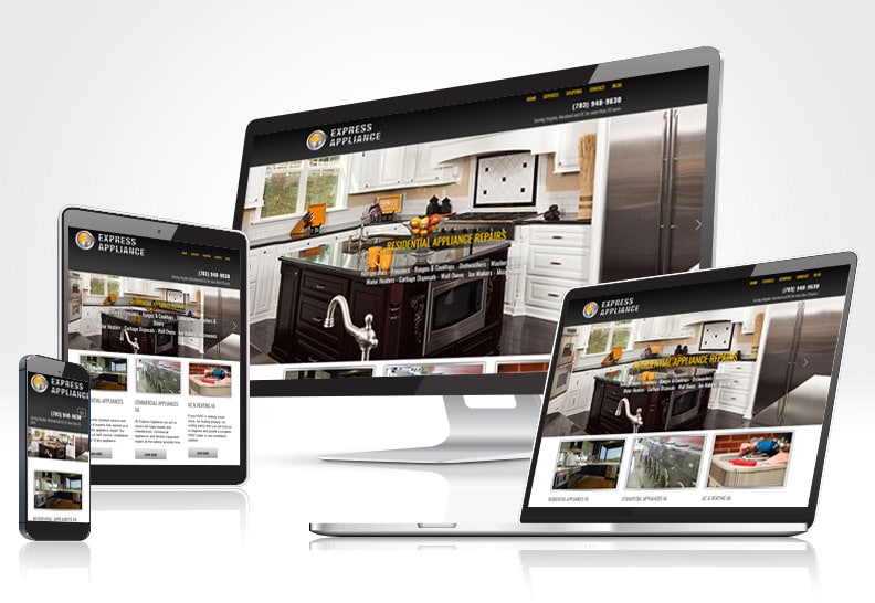
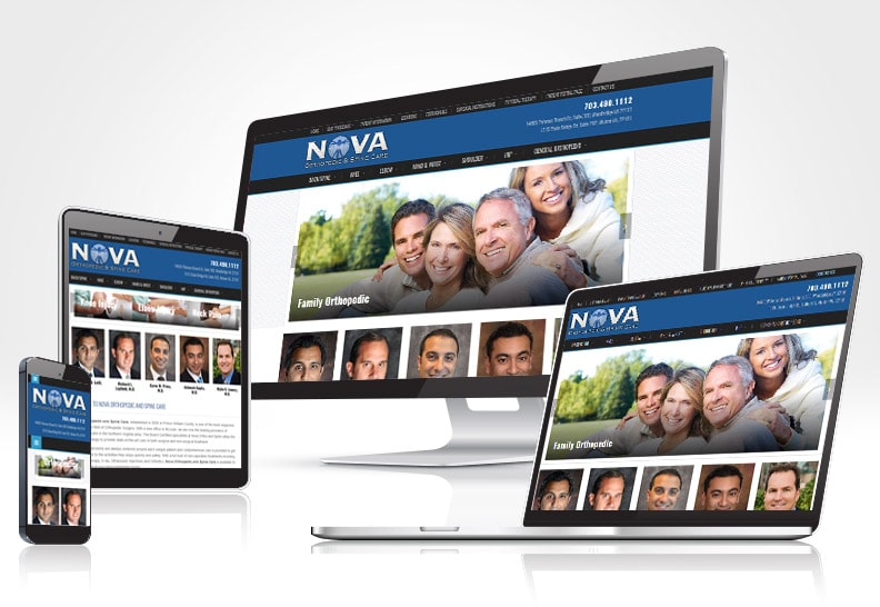
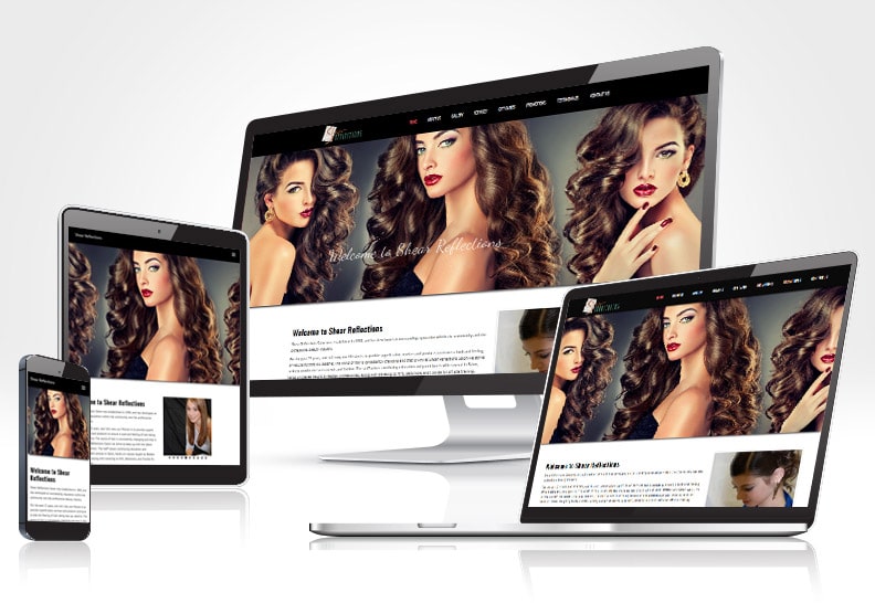
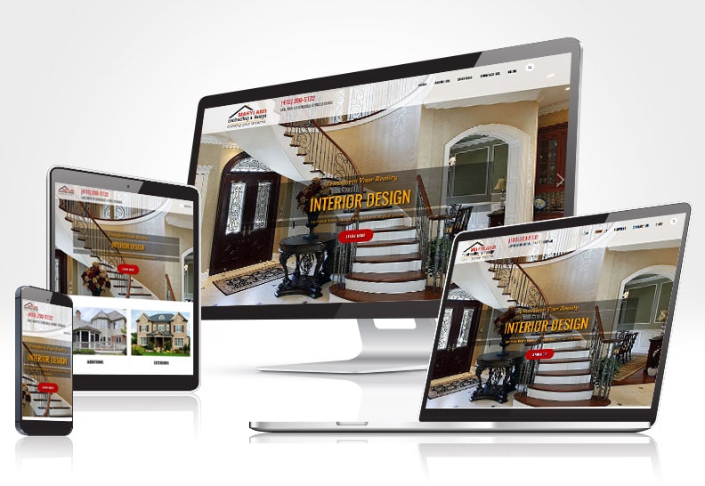
As more and more people are now accessing the web from their mobile and tablet phones, it is becoming more necessary to have a site optimized for these devices. A responsive website design enables your customers to easily navigate your website, which helps you increase your business’s online revenue. Responsive Design makes easy for websites to look beautiful across multiple devices.
WHY SHOULD I ADOPT RESPONSIVE WEB DESIGN?
A Responsive Web Design helps your website automatically adjust to the device of each unique visitor. A responsive website looks great on a variety of different screen sizes and ensures that the website is easy to use on any device whether it is on smartphone, tablet, or desktop computer.
It allows you to display your website’s content without reducing it for smaller screens and thus, any need to create a separate mobile and tablet optimized website is completely eliminated.
Every website that Dolexo creates is built with a responsive Web design.
What It Delivers
KEY FEATURES OF RESPONSIVE WEB DESIGN
-
Optimized for mobile & tablets
-
Optimized user experience
-
Optimized load speed
-
One site for all devices
-
Same code & files for all displays
-
Search engine friendly